CCC continues to enhance the customer experience by making system enhancements and resolving issues. Here’s an update of the recent product improvements we’ve made.
Freedom Medical Systems® 6.0
On August 1, 2021, your Freedom account is eligible for a free upgrade to the new web version of Freedom Medical Systems®. Designed as a browser-based application, Freedom 6.0 permits users to access the system from any device with an internet connection.
System Requirements
Freedom 6.0 does not fully support older browser versions. CCC recommends updating your browser to one of the following supported browsers and versions:
- Google Chrome version 91 and above.
- Microsoft Edge version 91 and above
Freedom 6.0 requires the following system configuration settings:
- Javascript support must be enabled in order to utilize Freedom 6.0.
- Configuration of browsers to open PDF documents in an external PDF viewer vs inside the browser.
- Configuration of browser to allow pop-ups from “[*.]ccc-webservices.com”.
- Minimum display resolution of 1360 x 960 pixels or greater.
User Requirements
Freedom 6.0 requires the following end-user prerequisites:
- End-user must have a valid email address associated with their Freedom User ID.
- End-user email address must be authenticated and verified using Freedom’s email verification process.
- End-user must accept the terms and conditions of the End User License Agreement (EULA).
What’s New
New User Interface
The new User Interface (UI) design found in Freedom 6.0 was born from being part of the wider User Experience (UX) initiative the development team is undertaking as part of our ongoing modernization efforts.
From the moment you log on, the user interface was arranged to reduce clutter, improve legibility, and optimize the display of information so that you can perform tasks more efficiently with fewer steps.
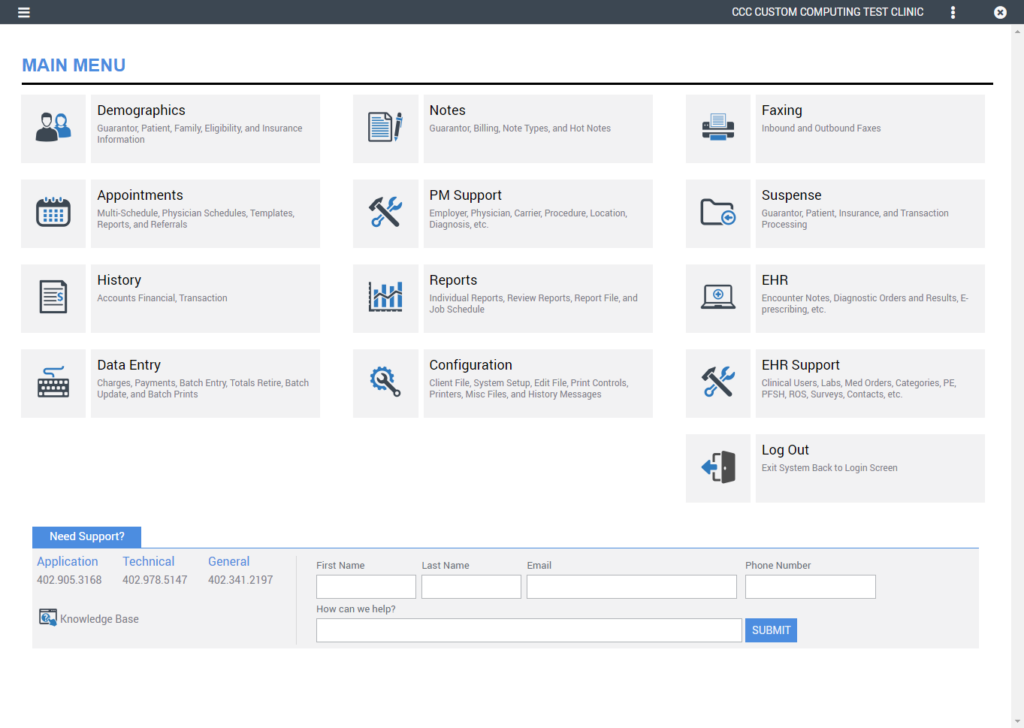
Main Menu
The Main Menu in Freedom 6.0 offers a clean modern design with helpful information to make navigating the system easier. A new support center was integrated into the main menu so that getting support is easier as well. When in a pinch, submit a support request directly from the main menu and a member of our Client Services team will follow up with you shortly.
Application Header
Freedom 6.0 contains a new application header region that is used for primary navigation and information display. Dynamic by design, this region changes based on the screens you access within Freedom. The following is an overview of the components found within the application header region:

- App Menu Icon – used to easily navigate to the various screens throughout the application via an expanding menu.
- Home Icon – the home icon is used to quickly jump back to Freedom’s Main Menu screen.
- Demographic Ribbon – is primarily used within the EHR to search and display patient demographic information.
- Client ID – displays the client ID for the associated database currently accessed by the user logged on.
- Screen Name – displays the screen name that is currently accessed by the user logged on.
- User ID – displays the system User ID for the current user logged on.
- Context Menu Icon – offers a limited set of choices that are available to the user based on the current context of the application.
- Close Icon – used to close the current screen.
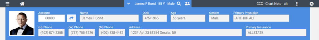
Patient Demographic Ribbon
The new patient demographic ribbon in the application header region is used to display key patient information at all times while navigating within the EHR. The following is a brief explanation of various elements of the patient demographic ribbon:

- Expand Icon – used to expand the patient demographic ribbon to display additional information.
- Patient Name – displays the selected patient’s first, middle initial, and last name.
- Age – displays the selected patient’s age in years.
- Gender – displays the selected patient’s gender.
- Search Icon – used to search and select patient accounts within Freedom.
- Resent Accounts Icon – displays a list of recent accounts accessed b the user and permits the user to quickly select a recent account.
If you hover your mouse over the demographic ribbon, it will expand down displaying additional patient demographic information as shown in the illustration below.
Moving your mouse away from the demographic ribbon will auto-collapse it. To pin the demographic ribbon, simply left-click the patient name with your mouse.
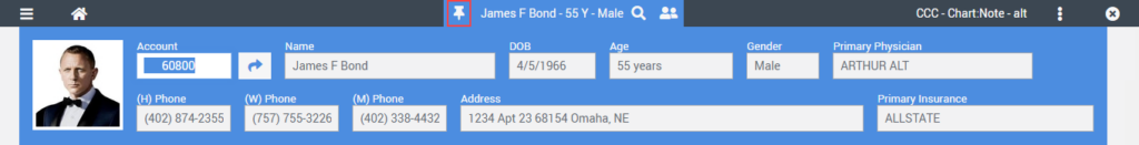
The Push Pin icon will replace the expanded arrow icon to indicate that the demographic ribbon is in the pinned mode. To unpin the demographic ribbon, simply left-click the patient’s name again.
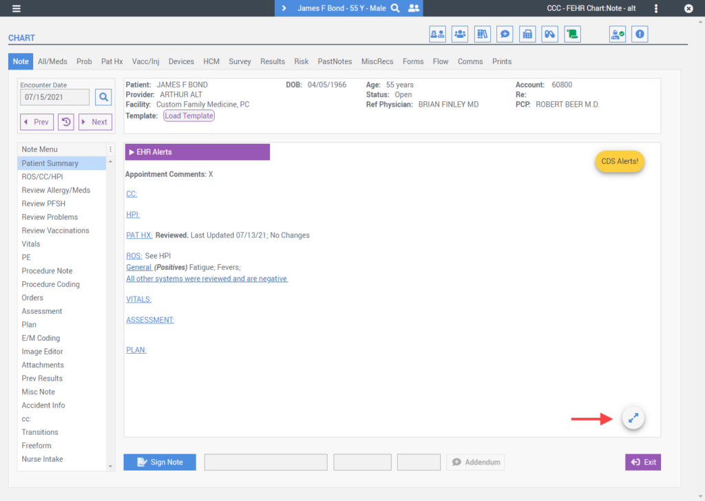
Floating Action Buttons
A new feature to Freedom 6.0 is the use of floating actions buttons which allowed the development team to place action buttons directly on top of the relevant content within the user interface. Floating action buttons are only available on scrollable regions of the user interface and remain floating in the same location regardless of the content they are floating over. Below are a few examples of the new floating actions buttons available in Freedom 6.0.
Edit Patient History
Quick-Text
CDS Alerts
View Note Full Screen
Undo
Grid Icons
Freedom 6.0 consistently uses graphic icons within grids to permit users to perform additional actions. The following is a brief overview of some of the new grid icons and their associated functions.
View & Context Menu Icons
- View Icon – located within the first two columns of a grid when available, the View icon indicates that there are additional record details available to the user. Single-click to view additional record details.
- Context Menu Icon– located in the last column of a grid when applicable, the context menu icon (AKA: 3 dots icon) within a grid indicates that there are additional actions available to the user for the selected content/row. Single-click to expand and view context menu options.
Edit & Patient Education Icons
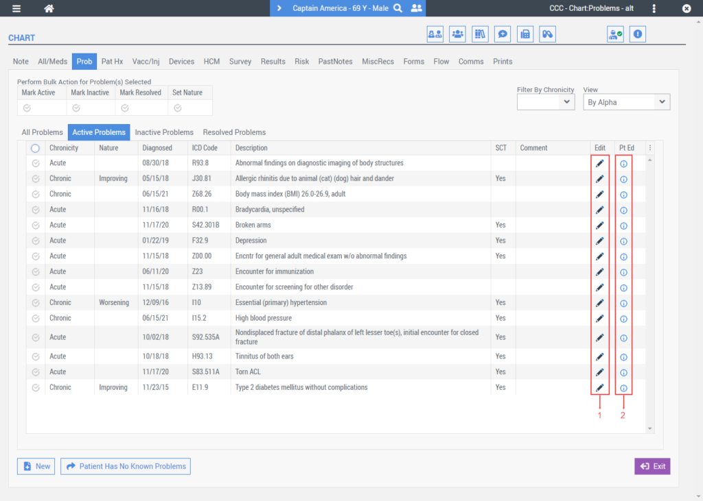
- Edit Icon – When applicable, the Edit icon will be displayed on the right side of grids indicating that the user is permitted to edit/update a record. A single-click of the edit icon will open the associated record detail screen for editing.
- Patient Education Icon – When available, the Patient Education icon indicates that 3rd party content is available for a paticular record. In the above example, the Problem list permits users to search 3rd party content for patient education handout material.
Grid Select All
The user interface in Freedom 6.0 includes a new Select All grid feature located in the upper left corner of selectable grids. A single click will either select or deselect all options within a grid list.
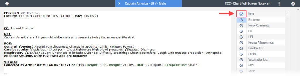
System Message Ribbon
An updated system message ribbon was added to the user interface and runs across the bottom of the application window. Within the system message ribbon, users will find application messages and a new Audit Record icon.
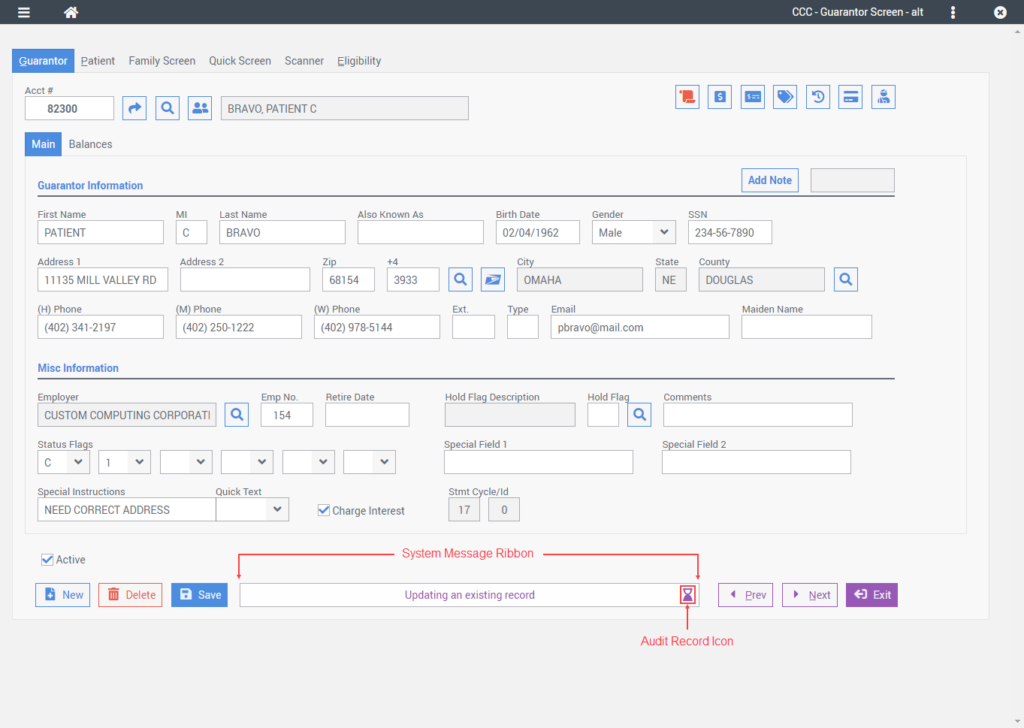
Selecting the Audit Record icon will display the audit pop-up screen illustrated below.
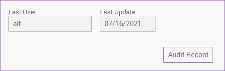
The audit pop-up screen changes based on the type of record being audited and may include the Last User, Last Update, Entered By, and Entered Date fields. When available the Audit Record button will open the detailed audit record screen displaying additional audit information.
PM Updates
Updated Screens
Multi-Schedule
The Multi-Schedule user interface was updated to improve its usability by removing several of the old icon buttons. In place of the buttons, two new roll-over menu options were added.
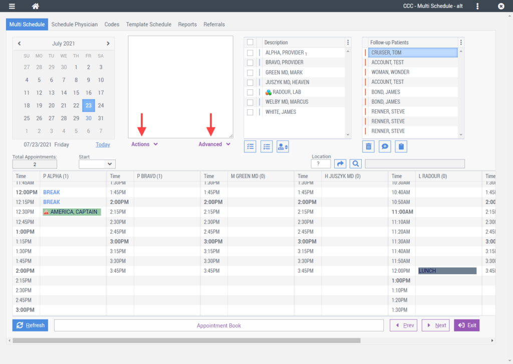
Moving your mouse over the Actions menu will display a menu of available actions the user can perform.
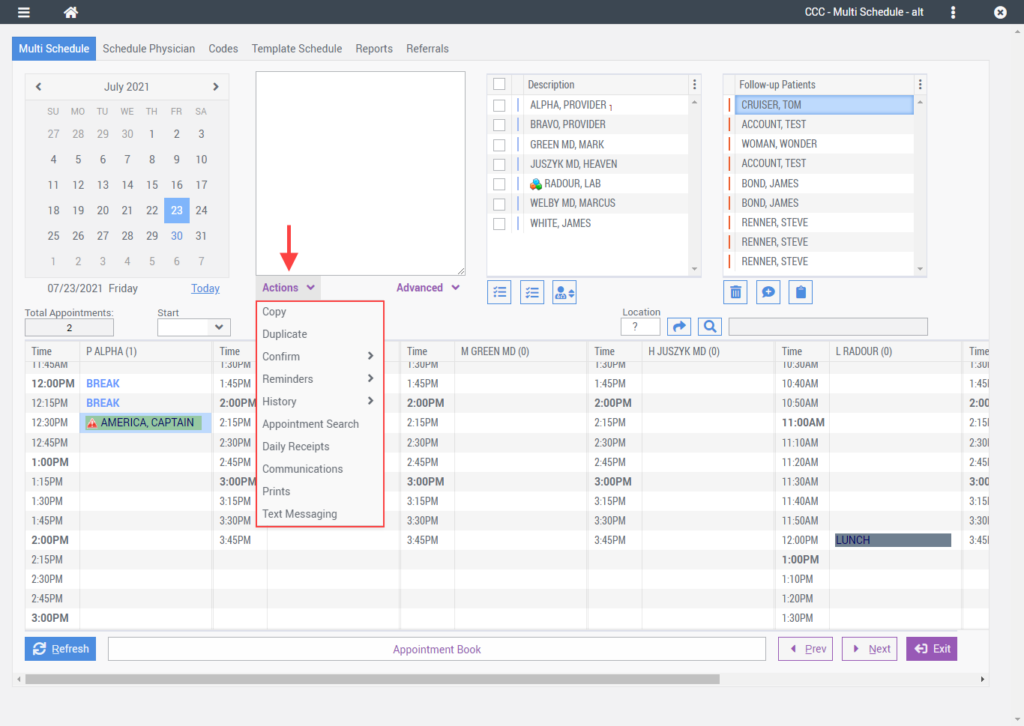
Moving your mouse over the Advanced menu will display a menu of available advanced functions.
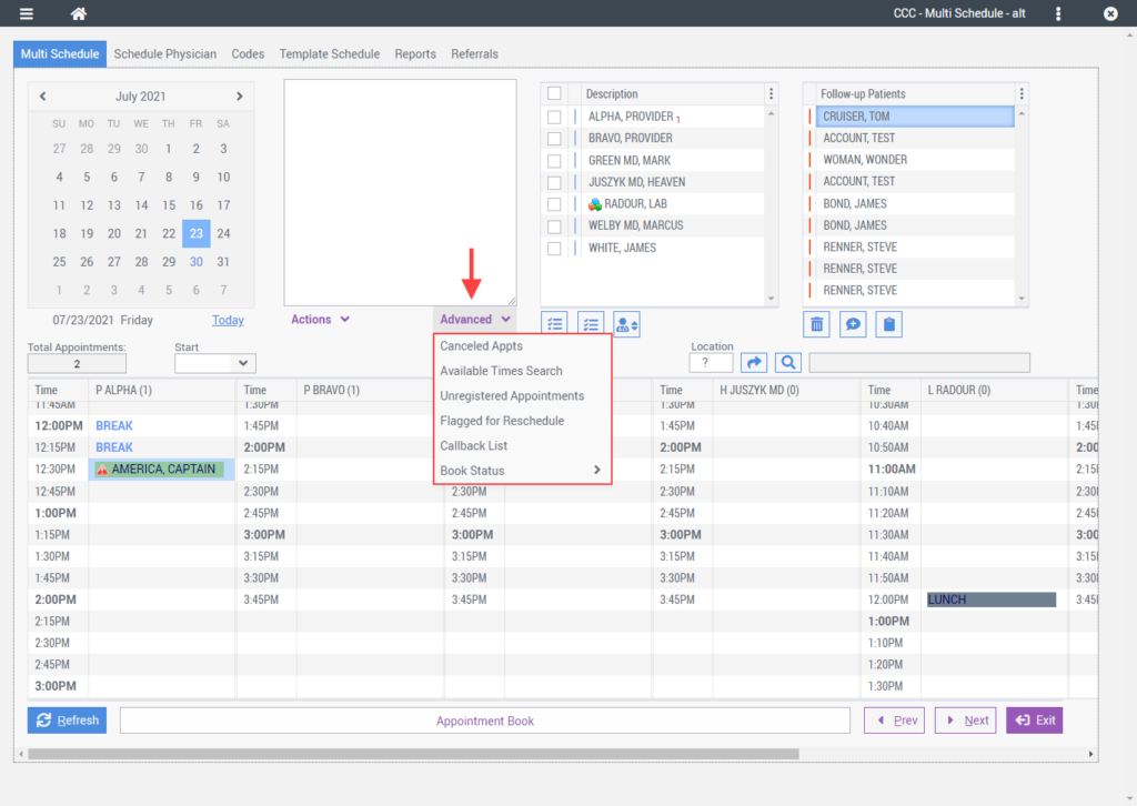
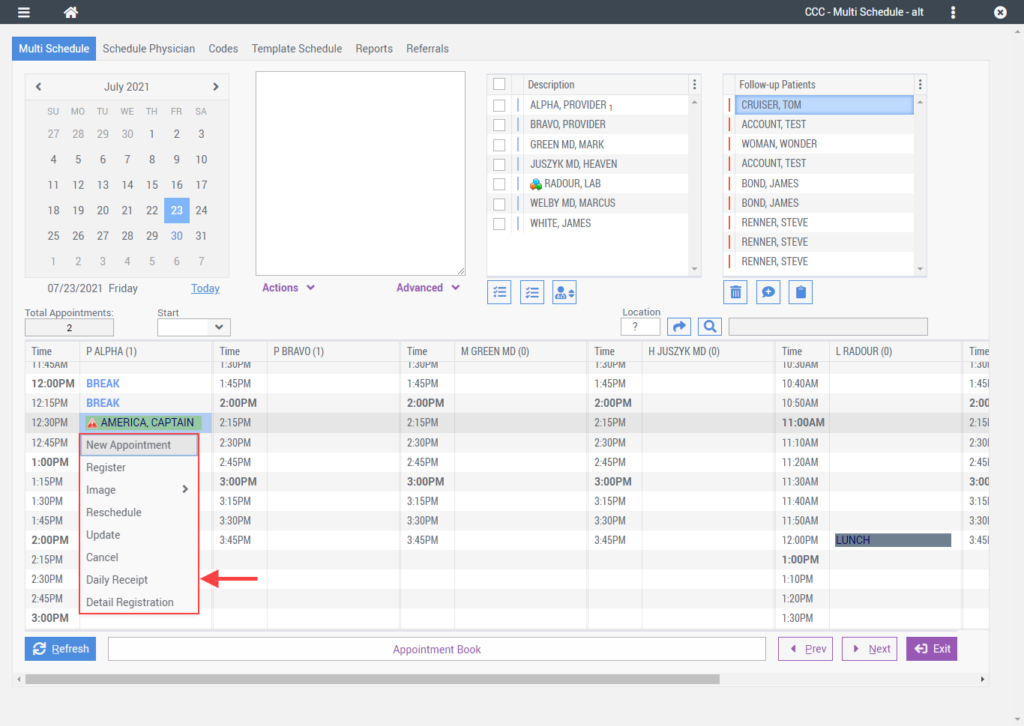
A new grid menu was added to the Multi-schedule grid. Selecting any appointment slot will bring up the grid menu which displays a list of frequently used actions a user can choose from.
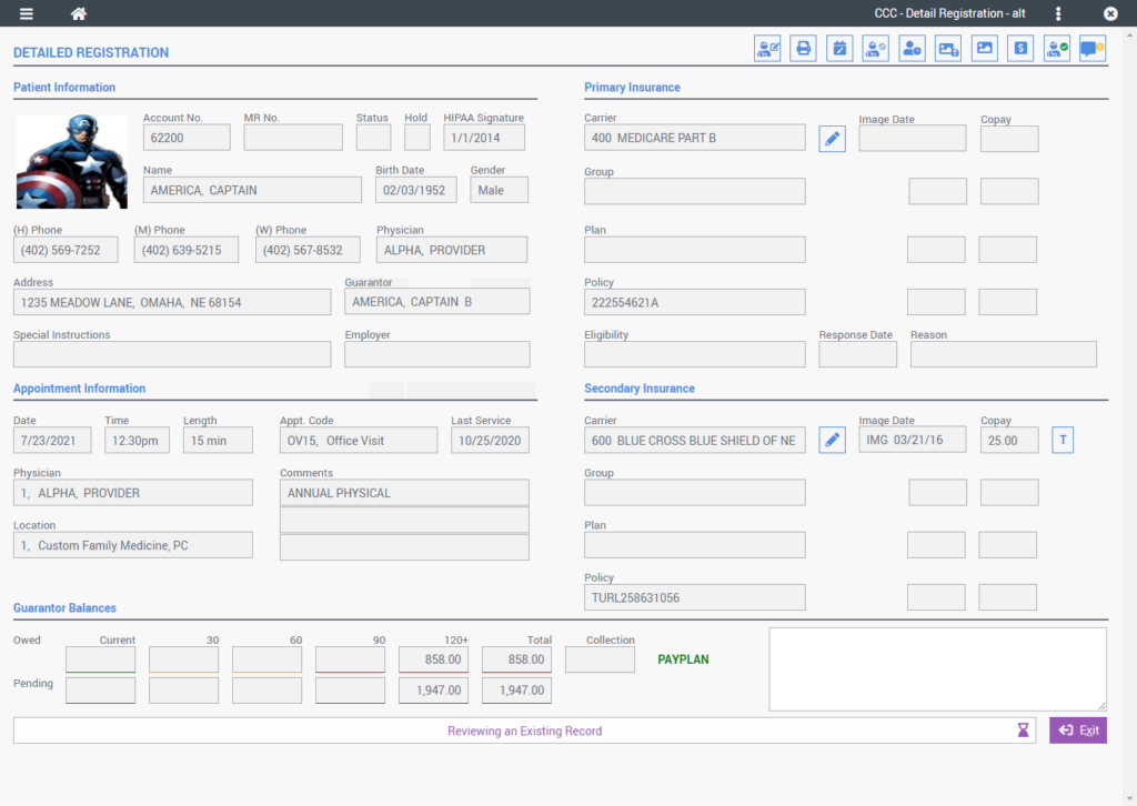
Detailed Registration
The Detailed Registration screen received an updated layout to better organize information and improve legibility.
History
The History tab was updated to include a new Preset Filters action menu for quick filtering of the account history data.
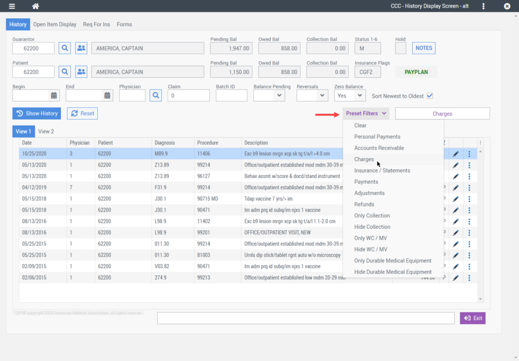
A new Context Menu column was added to the grid in place of the right-click menu.

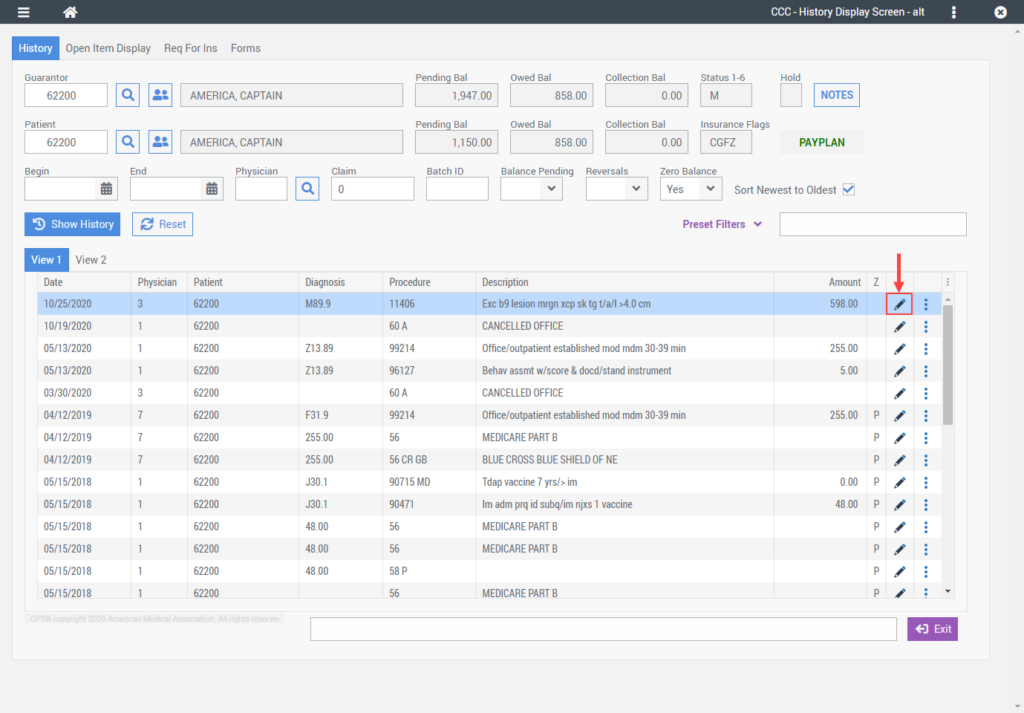
A new Edit column was added to the grid replacing the user action of double-clicking a row to edit a record.
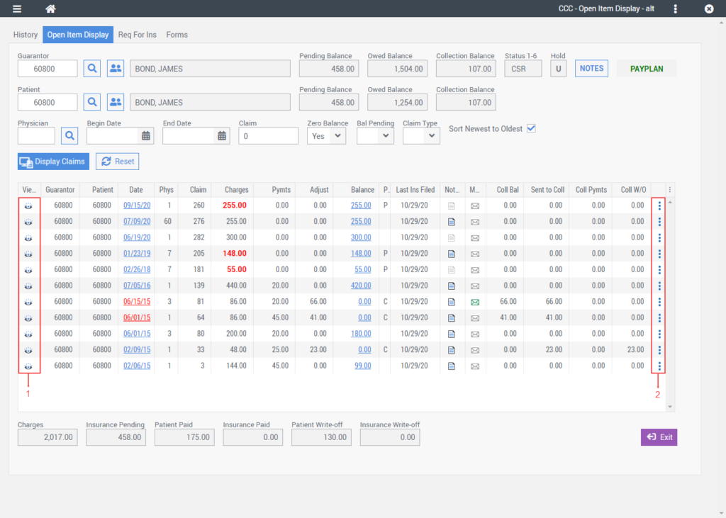
Open Item Entry
A new Context Menu column was added to the Open Item Entry grid in place of the right-click menu.
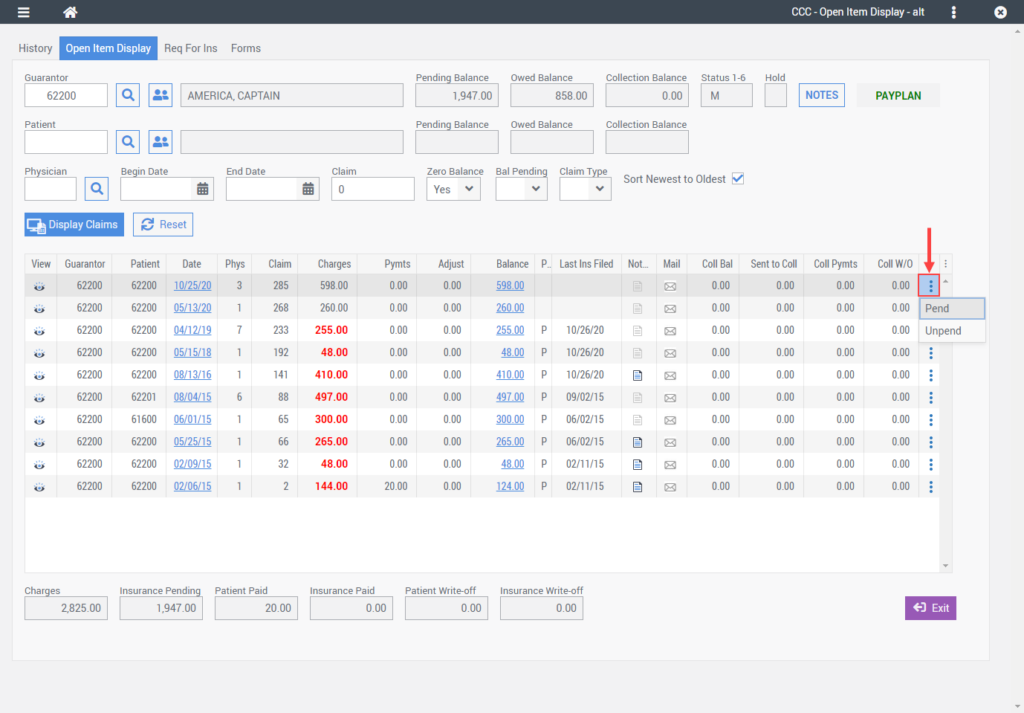
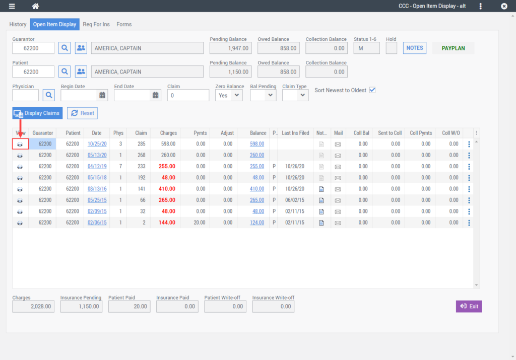
A new View column was added to the Open Item Entry grid replacing the user action of double-clicking a row to view the record details.
EHR Updates
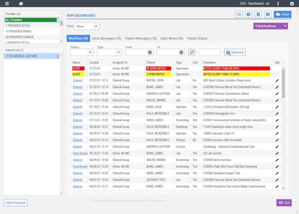
EHR Dashboard
The EHR Dashboard was updated to take advantage of the new system-wide application header region. The following is an overview of the changes made to the EHR Dashboard.
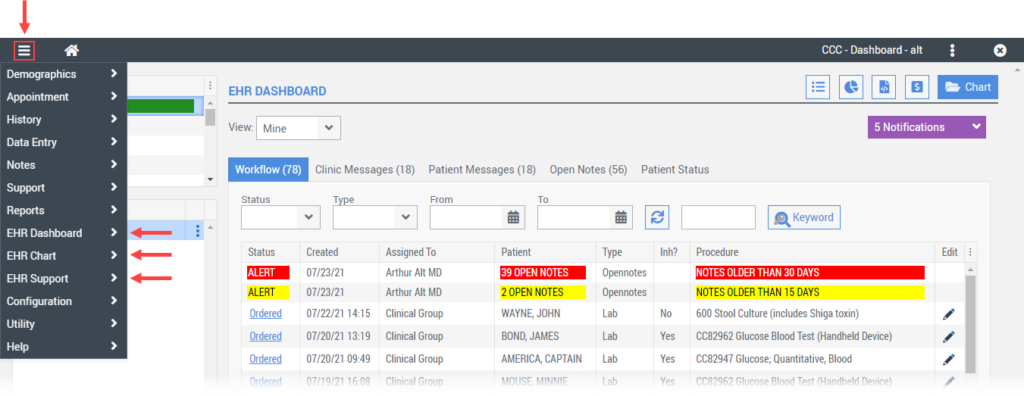
EHR Menu Options
The EHR menu that was once located on the right side of the EHR dashboard has been moved to the new App Menu within the header region.
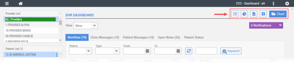
Quick Access Buttons
A new row of buttons was added to the top of the EHR Dashboard to permit quick access to Orders Tracking, Gap In Care, Templates, Billing, and the Chart. These screens are also accessible via the App Menu.
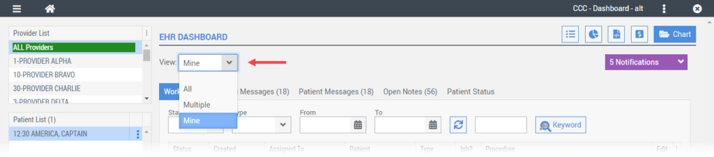
Dashboard View
The Mine, Multi, and All view buttons on the EHR Dashboard were replaced with a single drop-down View field. Defaulted to “Mine” upon first entering the EHR Dashboard, users can select from the available options to change the view of workflow, messages, etc.
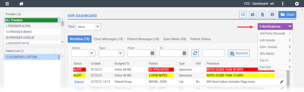
Notifications Label
A new Notifications label was added to the EHR Dashboard to consolidate notifications into a single location. The notifications label will display a total count of notifications based on the EHR Dashboard View selected. Hovering your mouse over the notifications label will display a list of notification types each with its own notification count. Clicking on a notification type will open the appropriate screen.
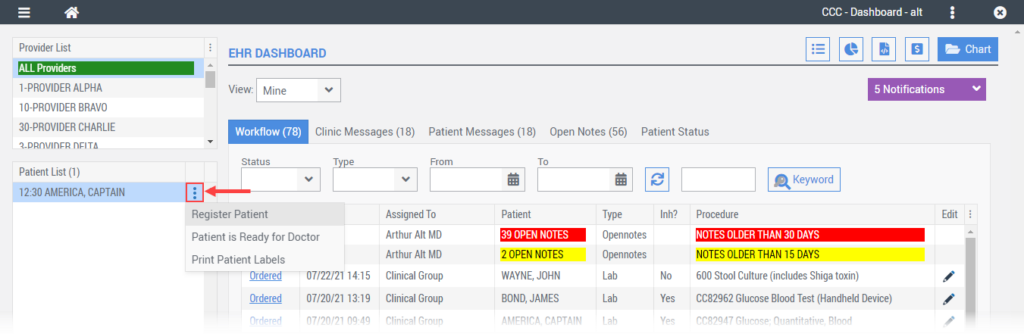
Patient List
The Patient List was updated with a new context menu replacing the former right-click menu.
Chart
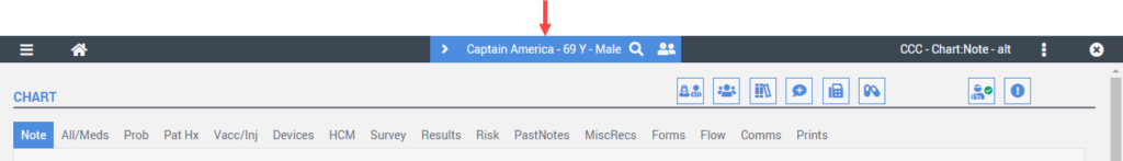
Patient Demographic Ribbon
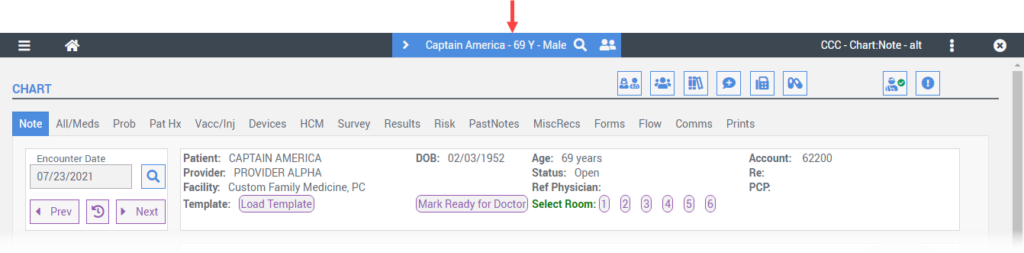
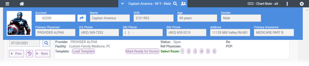
The new Patient Demographics Ribbon is located in the application header region and is used to search and display patient demographic information while in the Chart. When launching into a patient chart from the EHR Dashboard the patient demographic ribbon will load automatically for the selected patient.
However, there are times that you may be in the Chart with no patient selected. The patient demographic ribbon will indicate “Select Patient” when no patient is currently selected.
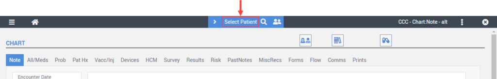
To select a patient, simply select the search icon and the Patient Search window will appear.
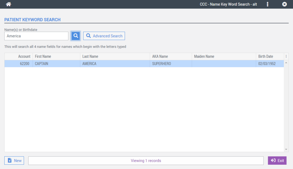
Upon selecting a patient, the patient’s name, age, and gender information will load in the demographic ribbon.
To view additional demographic data, simply place the mouse cursor over the demographic ribbon and it will auto-expand. Moving your mouse away from the demographic ribbon will auto-collapse it.
Note Tab
Encounter Date
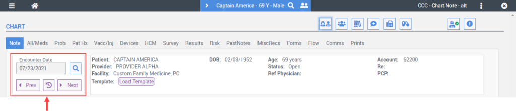
A new Encounter Date region was added to the Note tab so that users can quickly search and navigate between patient encounters.
Selecting the search button next to the Encounter Date field opens a new Encounter Search screen:
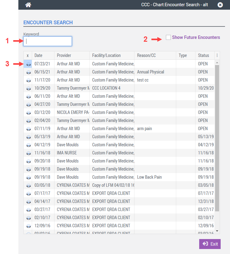
- Keyword – used to filter encounter results in the grid by keyword.
- Show Future Encounters – used to show and hide future encounters in the grid if the database is configured to show future encounters.
- View – used to view the encounter.
Below the Encounter Date field, are three new buttons that can be used to navigate between patient encounters quickly.
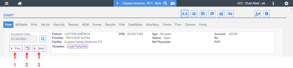
- Prev – used to navigate to the previous encounter date.
- Recent – used to navigate to the most recent or current encounter date.
- Next – Used to navigate to the next encounter excluding future appointments.
Encounter Information
A new Encounter Information region above the note preview region was designed to display pertinent encounter information at all times.
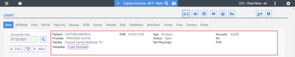
The Load Template, Unload Template, and Room buttons were moved to the Encounter Information region as well.
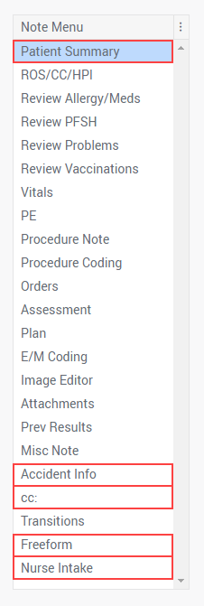
Note Menu
The Patient Summary; Accident Information; Carbon Copy (CC); Free-Form Note; and Nurse Intake buttons were relocated to the Note Menu:
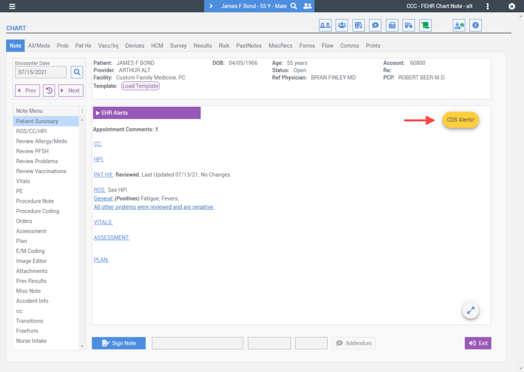
Note Preview
The Note Preview region was updated to include:
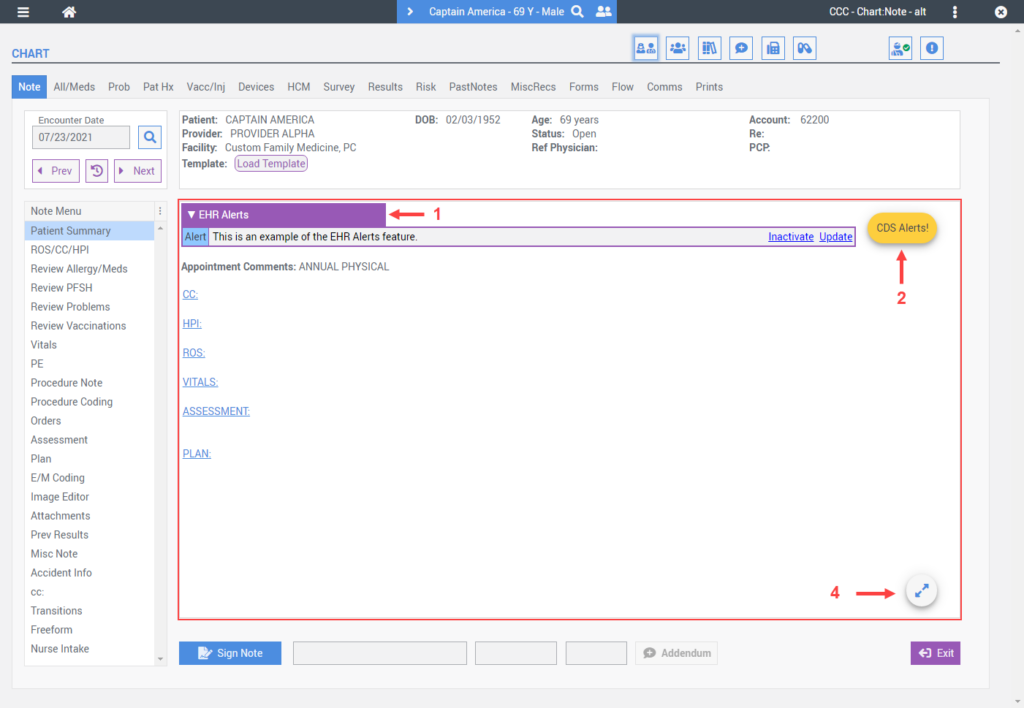
- A new collapsable EHR Alerts ribbon.
- A new CDS Alerts hover action button that remains visible to the user as they scroll through an encouner note.
- A new View Note Full Screen hover action button that remains visible to the user as they scroll through an encounter note.
Updated Screens
As part of the overall UI/UX enhancements in Freedom 6.0, several EHR screens were updated to reduce clutter and better organize the display of information.
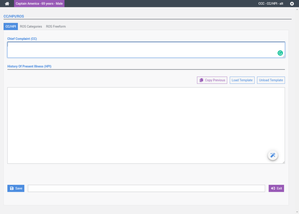
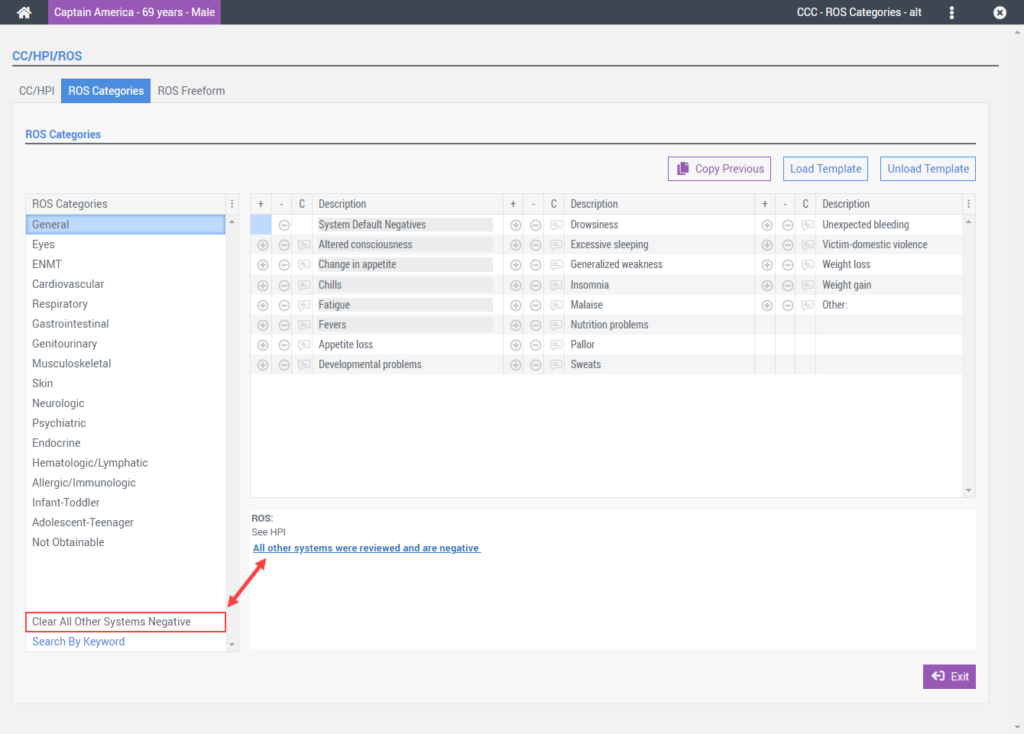
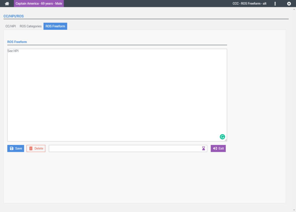
CC/HPI/ROS
The CC/HPI, ROS, and ROS Freeform Note screens were combined into a new tabbed user interface configuration that permits users to quickly move between screens in fewer steps.
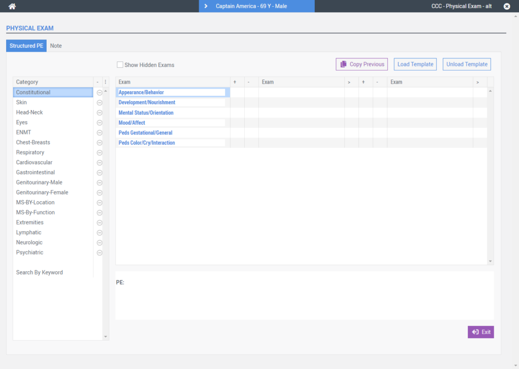
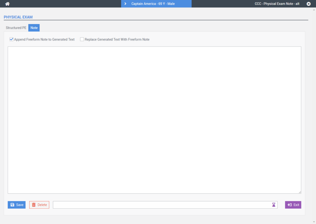
PE/PE Note
The Physical Exam (PE) and Physical Exam FreeForm screens were combined into a new tabbed user interface configuration.
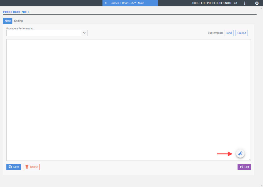
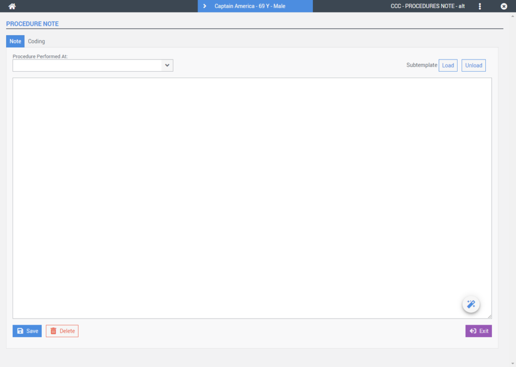
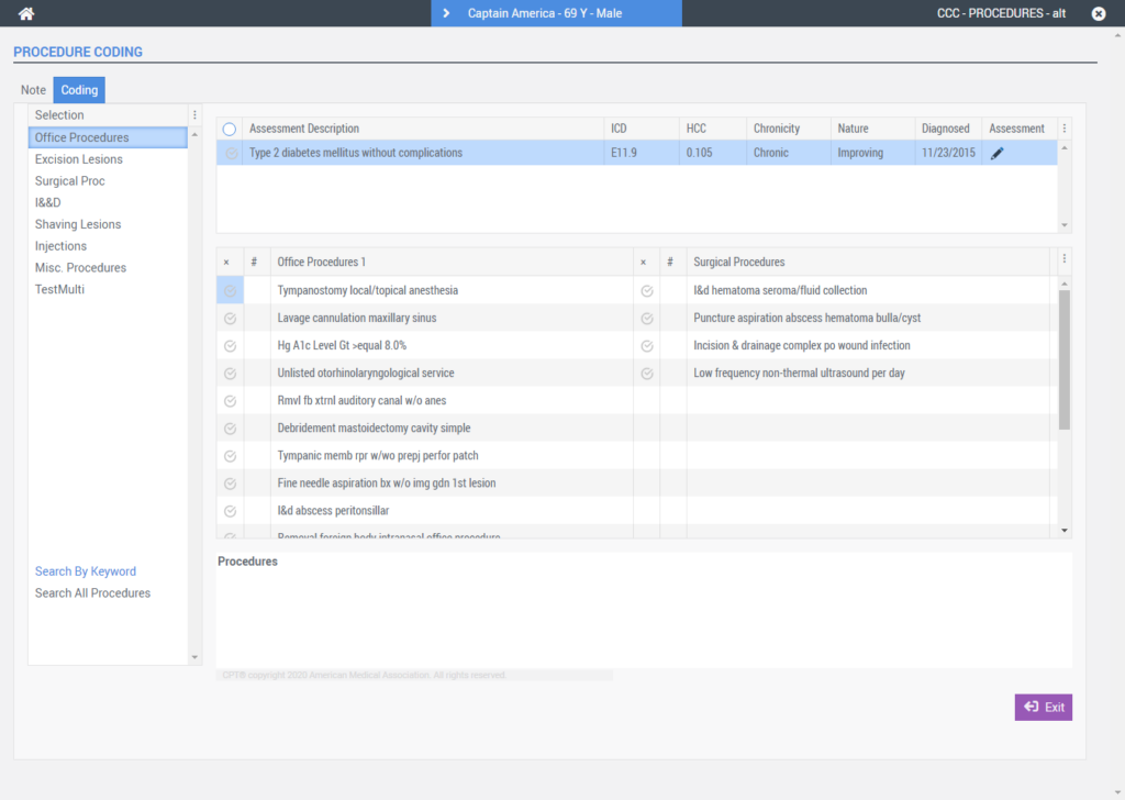
Procedure Note/Procedure Coding
The Procedure Note and Procedure Coding screens were combined into a new tabbed user interface configuration.
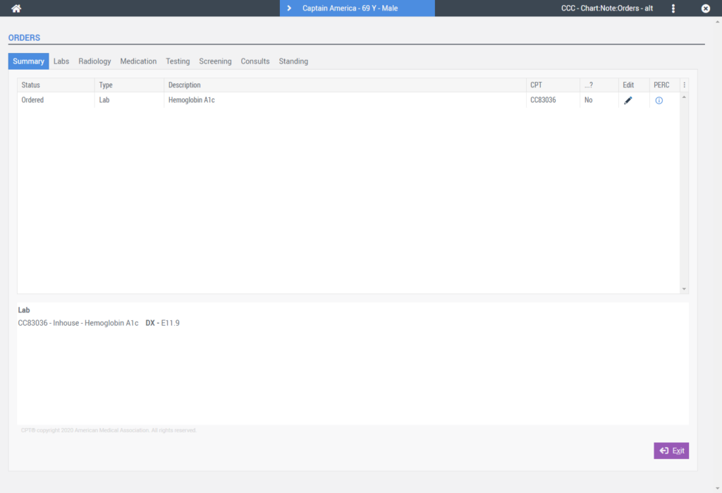
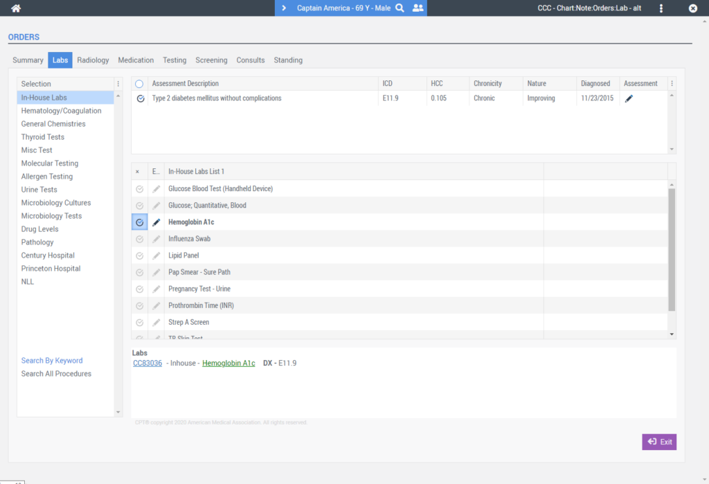
Order Entry Screens
A new Order Summary screen, as well as the various Order Entry screens, were combined into a new tabbed user interface configuration.
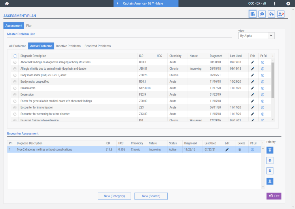
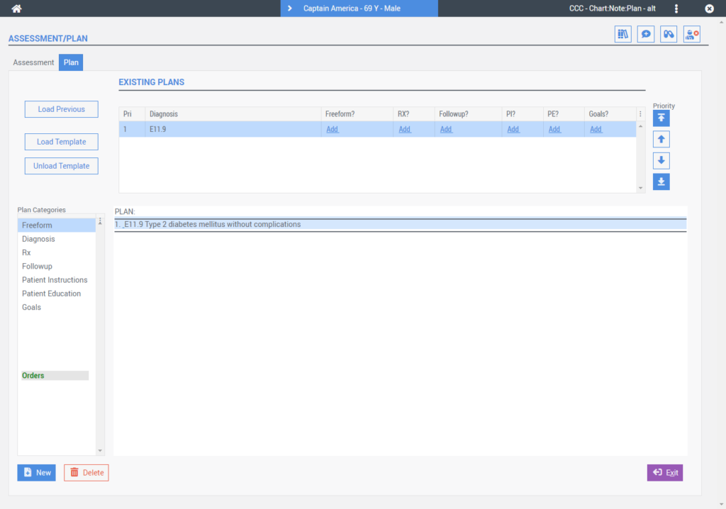
Assessment/Plan
The Assessment and Plan screens were combined into a new tabbed user interface configuration as well.
Vitals Screen
The Vitals screen was updated to include a new screen layout that organizes the vitals into separate categories for easier record entry.
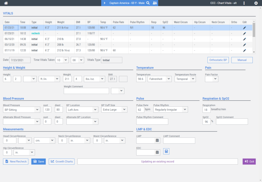
In addition to the new screen layout, recheck vitals can be recorded for any field.
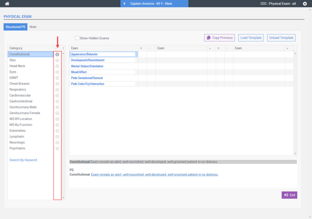
Structured PE
A new All Negative column was added to the PE categories menu in place of separate All Negative and Remove All Negative buttons.
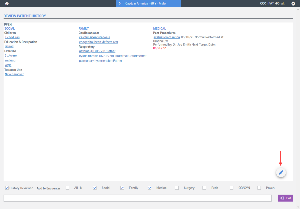
Review PFSH
The Review PFSH screen received a new floating action Edit button in place of the previous square button below the HTML region.

Vaccines
That Vaccines screen was updated to include a new Filter By Group field that permits filtering a patient’s vaccine list by the vaccines group code.
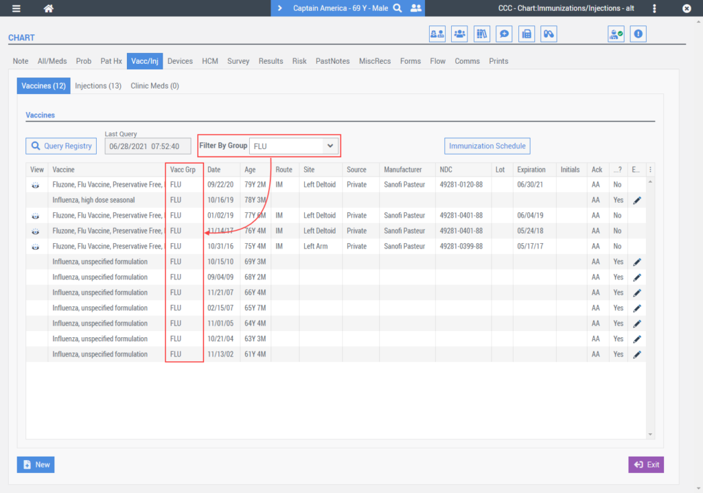
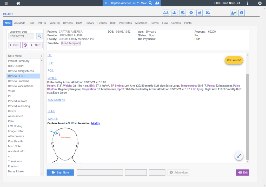
Image Editor
A new Image Editor option was added to the Note Menu that allows a user to upload stock or photo images to the encounter note and then annotate directly on the image before clicking done.
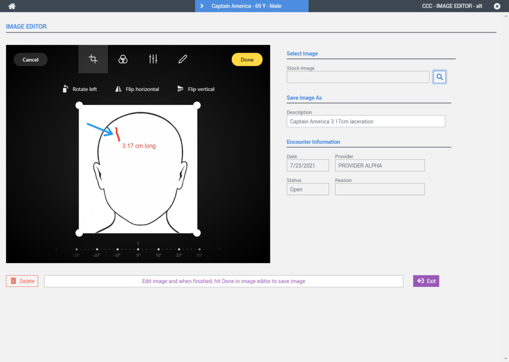
Once saved the Image will appear in the encounter note and can be modified as needed by selecting the modify link.
Consult Categories
The Consult order entry screen was updated to include a selection grid on the left side of the screen. Like other order types, the selection grid can be configured to organize EHR Contacts into consult categories by specialty. When selected, a predefined list of EHR Contacts you refer to for that specialty could be available for quick selection.
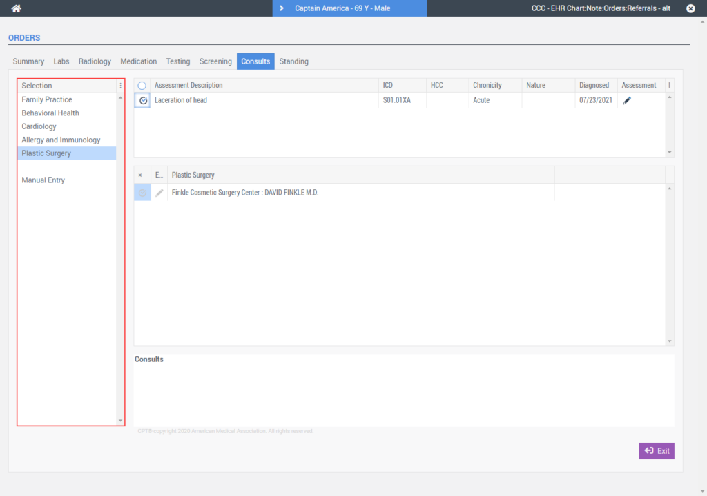
A Manual Entry option is displayed by default in the selection grid to permit users to create consult orders manually.
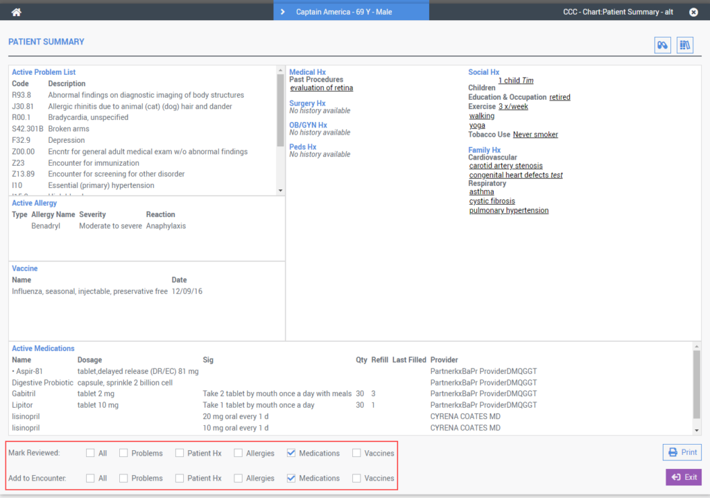
Patient Summary
The Patient Summary screen was updated to include new Mark Reviewed and Add to Encounter checkbox options.